
What is Light Spring?
Light Spring: Light Spring is the light warm season in the 12-season color analysis system. It sits between Light Summer and Warm Spring, so its best colors are light, warm-neutral, fresh, and clearer than Summer pastels.
Seasonal color analysis uses color dimensions such as hue, value, and chroma. Those dimensions are part of formal color notation systems such as Munsell, then translated by analysts into the practical language of warm vs cool, light vs deep, and soft vs bright. If those terms are new, the color theory basics guide covers hue, value, and chroma before you read the rest of this page.
The label is useful only if it changes real choices. A good Light Spring result should make shirts, makeup, hair color, jewelry, and neutrals easier to repeat.
Light Spring color dimensions
Light Spring is light first and warm second. The palette needs lift before heat. If a color is warm but heavy, it usually drags the face down. If it is light but cool and dusty, it can turn flat.
- Dark Light Value
- Soft Bright Chroma
- Cool Warm Temperature
| Dimension | Light Spring | What to test |
|---|---|---|
| Temperature | Warm-neutral. Light Spring is warmer than Light Summer, but softer and lighter than Warm Spring. | Compare warm and cool versions of the same color near the face. |
| Value | Light. Lightness is the main trait, so heavy darks usually overpower the face. | Compare light, medium, and deep drapes without changing temperature. |
| Chroma | Clear to medium-clear. The colors need freshness, but they should not become neon or high-contrast. | Compare muted and clear versions of a similar hue. |
| Contrast | Low to medium contrast. Outfits usually work best when the lightness stays consistent. | Watch whether the face improves with tonal styling or stronger contrast. |
Light Spring compared with neighboring seasons
| Test | Light Spring | Neighboring seasons |
|---|---|---|
| Temperature | Warm-neutral | Light Summer is cooler. Warm Spring is warmer |
| Value | Light | Warm Spring is slightly deeper. Soft Autumn is heavier |
| Chroma | Clear to medium-clear | Light Summer is softer. Bright Spring is brighter |
| Best test color | Peach, butter yellow, light aqua | Mauve often fails. Black is usually too heavy |
A neighboring result is also common when two analysts use different systems. See 12-season vs. 16-season color analysis if your result changed between a 12-season and 16-season sitting.
Light Spring contrast and outfit balance
Light Spring usually carries low to medium contrast. Keep the lightness close across an outfit, then add one clear warm accent near the face.
- Pair warm ivory with honey beige, peach with golden camel, or fresh mint with clear sky blue.
- Use light warm navy in shoes, denim, or a small outer layer instead of building the outfit around black.
- Let coral, warm pink, or butter yellow do the visual work. Several dark pieces at once can make the outfit look heavier than the palette.
How to tell if you are Light Spring
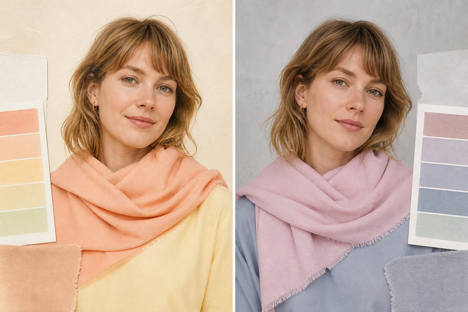
You identify Light Spring by drape response, not by one feature. Skin, hair, and eyes matter, but the deciding evidence is how controlled colors change the face.
Skin undertone signals
Light Spring skin often reads ivory, peach, light golden beige, neutral-warm, or warm olive. The useful test is whether peach, butter yellow, fresh mint, and light aqua make the face clearer without needing stronger makeup.
Surface redness, tanning, foundation, and phone white balance can distort undertone. Test on clean skin in indirect daylight, with dyed hair pulled away if the color changes your natural contrast.
Hair color signals
Hair often reads golden blonde, strawberry blonde, light copper, dark blonde, or light golden brown. The overall hair-to-skin contrast usually stays gentle rather than sharp.
Natural hair is more useful than a current dye job. If your hair is colored, focus on whether the right palette makes the skin clearer before judging whether the hair matches.
Eye color signals
Eye colors can include blue, green, aqua, light hazel, amber, or light warm brown. The eyes often look brighter when surrounded by fresh light colors instead of dusty pastels.
Eye color is supporting evidence. The same blue, brown, green, or hazel eye can appear in several seasons, so use the eye response to confirm the drape result rather than choose the result.
Common confusion seasons
Light Spring is most often confused with Light Summer, Warm Spring, and Soft Autumn. Test lightness first, then temperature and clarity.
- Light Spring vs Light Summer: Light Summer is light and cool. Light Spring is light and warm, so peach, butter yellow, and warm aqua usually look clearer than powder pink, periwinkle, and blue-gray.
Controlled test: Compare peach with powder pink, then warm ivory with cool off-white. Keep the depth equally light and look for the colour that makes shadows and redness less noticeable. - Light Spring vs True Spring (Warm Spring): True Spring, also called Warm Spring, is warmer and more saturated. Light Spring needs the same sunny direction with less depth, heat, and contrast.
Controlled test: Compare pale peach with clear coral, then honey beige with cognac. Light Spring usually needs the lighter version to keep the face present. - Light Spring vs Bright Spring: Bright Spring is clearer and higher contrast. Light Spring needs freshness, but it should still feel delicate and airy rather than vivid or sharp.
Controlled test: Compare light coral with hot coral, then clear sky blue with electric blue. Keep the temperature warm-neutral and notice when colour starts arriving before the face.
The Light Spring color palette with hex codes
The Light Spring palette works when every color respects the same temperature, value, and chroma pattern. Hex codes are digital approximations. Use them for shopping, mood boards, and comparison, not as a replacement for fabric draping.
Warm Ivory
#FFF1D6
A light warm neutral that is easier than optic white.
Peach
#F6B38A
A core color because it repeats Spring warmth without becoming orange.
Light Coral
#FF8F7A
A fresh pink-orange for tops, blush, and lips.
Warm Pink
#F7A6B8
A clear warm pink that avoids Summer dustiness.
Butter Yellow
#F7D86A
A soft yellow that supports lightness without turning mustard.
Fresh Mint
#9FD8B5
A warm light green that looks clearer than sage.
Light Aqua
#68C7C1
A blue-green that keeps the palette fresh and warm-neutral.
Clear Sky Blue
#67BDE0
A clean blue that works better than gray-blue.
Golden Camel
#C99A5B
A light warm neutral for leather, coats, and trousers.
Soft Apricot
#F2BF90
A low-stakes warm accent for knits, prints, and makeup.
Light Warm Navy
#3E6F91
A gentle dark neutral when black is too severe.
Honey Beige
#D8B477
A practical neutral that stays lighter than Autumn camel.
Light warm neutrals
Warm ivory, honey beige, golden camel, soft apricot
Use these for knitwear, trousers, shoes, bags, and the lightest part of an outfit.
Peach, coral, and pink
Peach, light coral, warm pink, soft apricot
These are the easiest near-face colours for tops, lipstick, blush, prints, and scarves.
Light yellow and greens
Butter yellow, fresh mint, light aqua
Use these when the palette needs freshness without the depth of olive or the sharpness of neon yellow.
Blues and darker accents
Clear sky blue, light aqua, light warm navy
Use these for denim, shirts, outerwear, and smaller accessories when a blue direction is needed.
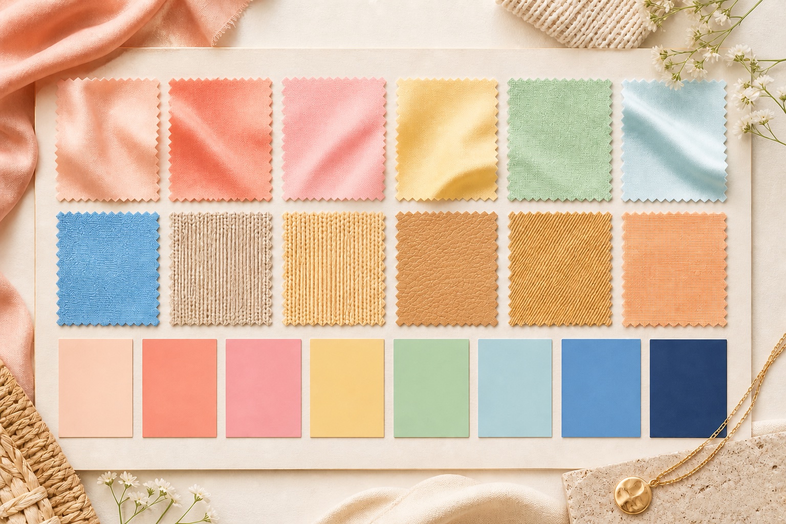
Compare this palette with the complete 12-season chart before shopping from a screenshot. Palette cards vary by analyst and printing method.
How to test the Light Spring palette
The best home test for Light Spring is a controlled fabric comparison. Use clean skin, indirect daylight, a plain background, and two colors that differ by one dimension at a time.
Start with temperature. Hold one likely Light Spring color near the face, then hold the closest opposite from a neighboring season. Watch the skin around the mouth, nose, under-eyes, and jawline. The better color usually makes those areas look calmer and more defined.
Test value second. If the palette is too light, the face can look unsupported. If it is too dark, the fabric may arrive before the person. The right value creates structure without forcing you to add heavy makeup.
Test chroma last. Clear colors can make a soft season look tired because the fabric is louder than the face. Muted colors can make a bright season look dusty. The right chroma makes the eye color, skin, and hair look connected.
Do not type yourself from a single good shirt. One shirt can work because of neckline, contrast, texture, or makeup. A season result should repeat across several fabric colors, lipstick families, metals, and neutrals.
Keep brief notes while you test. Write down which colors reduce shadows, which colors create redness, and which colors make the fabric more noticeable than your face.
If the test stays close after several rounds, book a professional draping session. Borderline results are normal, especially between adjacent seasons that share temperature, value, or chroma. Preparing for in-person color analysis covers what to bring and what to expect so the session confirms a genuinely close call.
What to wear as Light Spring
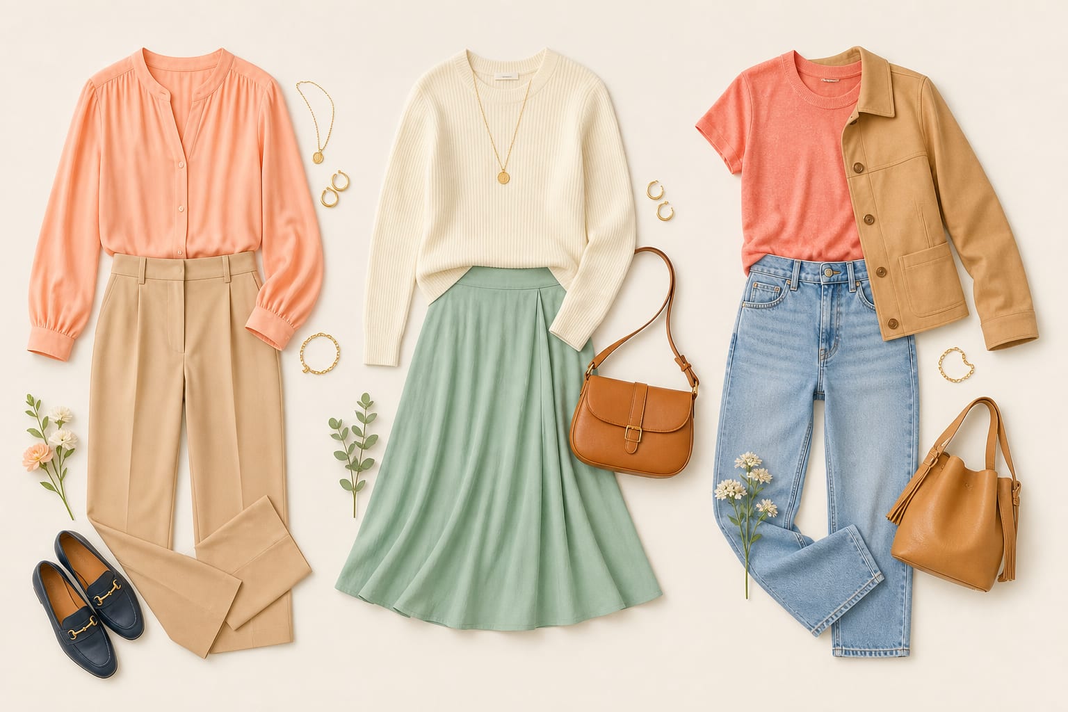
Light Spring outfits work best when tops, bottoms, neutrals, and accessories repeat the palette instead of fighting it. Start with colors near the face, then fix shoes, bags, and outerwear.
Choose warm ivory, peach, light coral, warm pink, butter yellow, fresh mint, light aqua, and clear sky blue.
Use golden camel, honey beige, light warm navy, clear sky blue, or warm ivory. Keep darks limited and softened.
Neutrals
The best neutrals are warm ivory, honey beige, golden camel, light warm navy, and soft apricot beige.
See how this compares with every other palette in best neutrals for each season.
Worst colors to avoid
Avoid black, optic white, burgundy, dark charcoal, muddy olive, dusty mauve, espresso, and heavy navy.
Black is the color most often asked about across every season. Can every season wear black? covers where Light Spring lands and which exceptions apply.
Jewelry and metals
Light yellow gold, warm rose gold, and polished champagne metals usually work better than dark antique finishes.
Leather, eyewear, and stones
Choose honey beige, golden camel, light tan, warm taupe, or light warm navy leather for shoes, bags, and belts.
Light tortoiseshell, translucent champagne, warm clear pink, light gold, and soft aqua frames usually work better than matte black or heavy dark brown.
Citrine, light peridot, peach moonstone, pale turquoise, warm pearls, and light champagne stones are useful starting points when the setting stays light.
Light Spring color rules: black, white, denim, and red
Can Light Spring wear black?
Light Spring can wear black in small accents, but light warm navy, golden camel, and honey beige are usually easier near the face. A black shoe or belt is lower risk than a black top.
What white is best for Light Spring?
Choose warm ivory, cream, or a soft yellow-pink off-white instead of optic white. Stark white can make the palette look cooler and harsher.
Can Light Spring wear denim?
Yes. Clear light-blue denim and softened medium warm-blue denim are good starting points. Avoid very dark inky denim near the face when it creates too much contrast.
What red is best for Light Spring?
Choose light coral, watermelon, warm pink-red, or clear peach-red. Burgundy, wine, and blue-red usually add too much depth or coolness.
Light Spring color combinations
Light Spring outfits are easiest to repeat when one color leads, one supports it, and one grounds the look. These combinations use colors already in the palette, so they are a practical starting point rather than rigid rules.
Easy near-face color
Wear Warm Ivory or Warm Pink near the face, then use Honey Beige for a shoe, bag, trouser, or outer layer.
Color with a neutral base
Use Golden Camel as the base, then add Peach and Light Aqua. It gives the outfit color without making every piece compete.
Three-color outfit
Pair Light Coral, Light Aqua, and Honey Beige when you want more contrast. Keep one color dominant and use the others in smaller areas.
Prints and patterns for Light Spring
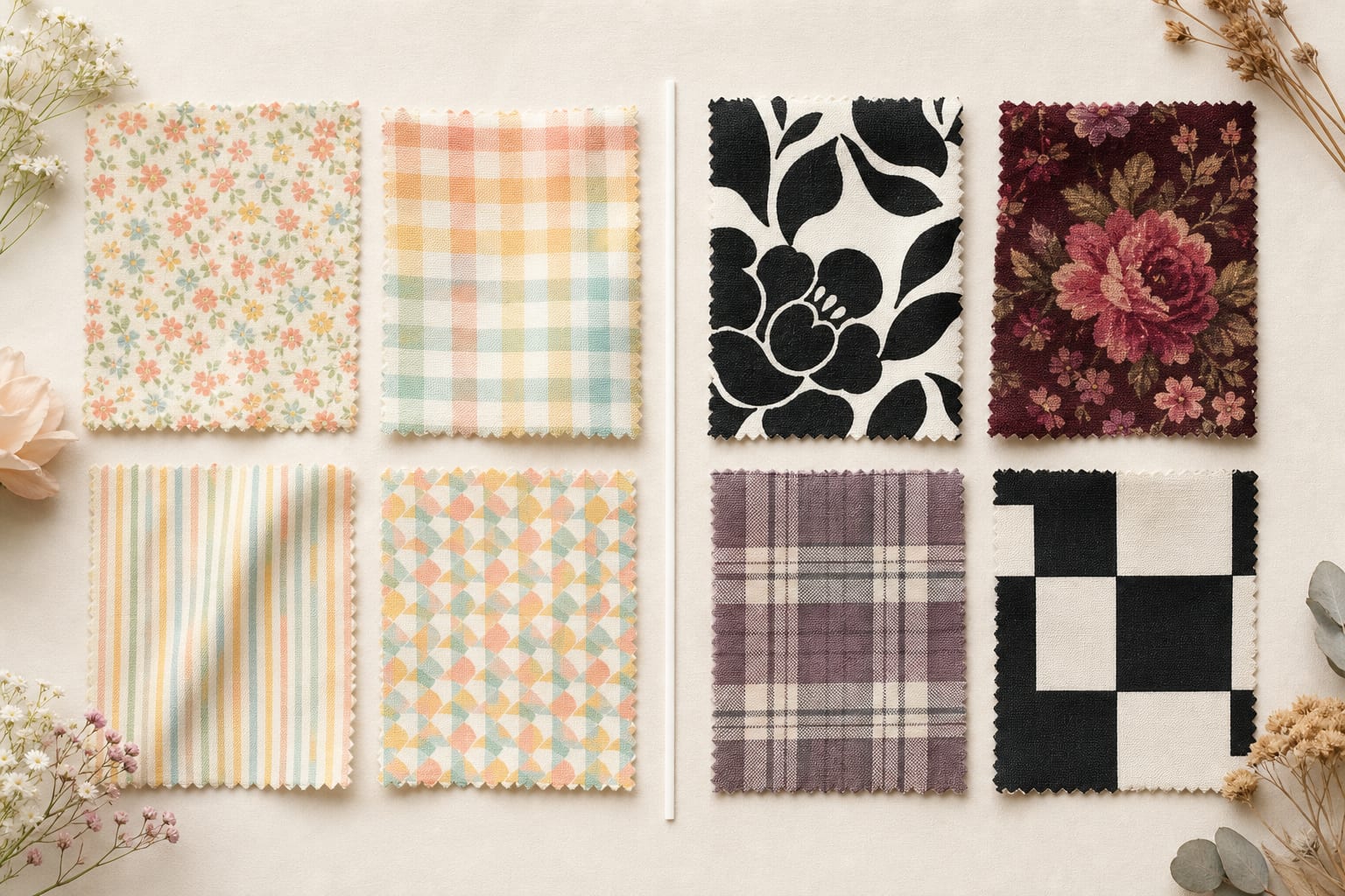
A Light Spring print works best when its colors repeat the same temperature, value, and chroma direction as the rest of the palette. Choose prints with clean color separation. Clear florals, stripes, checks, and graphic motifs are usually easier than hazy or dusty color blends.
Low to medium contrast usually holds together best. Keep the colors close in depth so the print does not arrive before the face.
Light Spring prints work best with small to medium elements, rounded motifs, and low to medium contrast. Choose light florals, fine checks, narrow stripes, and playful geometrics in clear warm colours. Avoid black-and-white graphics, large dark blooms, dusty mauve plaids, and harsh square blocks near the face.
Before buying a print, check the colors closest to your face. If the background, border, or dominant motif falls outside your best colors, treat it as a lower-body or accessory piece instead. The same printed hue can also read differently by season; how the same color changes across seasons shows why.
Borrowing from adjacent palettes
Light Spring can borrow from Light Summer and True Spring when the borrowed colour keeps the outfit light and the face warm-neutral.
Light Summer
Borrow: Choose the warmer light aqua, soft sky blue, and pale pinks when they do not turn gray or blue beside the skin.
Leave behind: Leave cool lavender, blue-gray, and dusty mauve when they flatten the warmth in the face.
True Spring (Warm Spring)
Borrow: Choose its lighter peach, warm aqua, and clear coral shades when they still feel light enough near the face.
Leave behind: Leave deep camel, strong orange, tomato red, and saturated greens when they overpower the palette.
Light Spring makeup
Light Spring makeup should repeat the palette at a smaller scale. The most common mistake is wearing a technically pretty color that belongs to a neighboring season.
Foundation undertone
Foundation usually needs neutral-warm, peach, ivory, or light golden direction. Avoid gray-pink and heavy matte bases.
Lipstick
Use peach, light coral, warm pink, apricot, clear rose, and soft watermelon. Skip berry, burgundy, and brown nude.
Eyeshadow and liner
Eyeshadow works in peach beige, honey, light bronze, soft camel, mint, and aqua. Brown mascara is usually easier than black.
Blush
Choose peach, apricot, light coral, or warm pink with a fresh finish.
Light Spring hair color
Hair color affects how easy the palette is to wear. The best hair direction supports your natural temperature, depth, and contrast instead of creating a second, competing palette around the face. For a longer walkthrough of testing dye and highlight direction against your result, see hair color analysis.
Best natural shades
The best natural direction is golden blonde, strawberry blonde, light copper, dark blonde, or light golden brown.
Best dye options
Good dye options include honey blonde, light golden brown, strawberry blonde, soft copper gloss, and warm beige blonde.
Hair colors to avoid
Avoid blue-black, ash brown, smoky lowlights, platinum, violet brunette, and heavy dark color near the face.
Start using your Light Spring palette
Start with a few repeatable choices instead of replacing a whole wardrobe. The goal is to notice whether the same color direction improves your face across several outfits.
- Save five core colors. Begin with Warm Ivory, Peach, Light Coral, Warm Pink, and Golden Camel.
- Choose two reliable neutrals. The best neutrals are warm ivory, honey beige, golden camel, light warm navy, and soft apricot beige.
- Build three outfits. Try one color near the face, one supporting color, and one neutral from the combinations above.
- Test before you replace. Compare a likely good color with a close alternative in indirect daylight. Use the home draping method and write down the repeated result.
Light Spring celebrity examples
These public figures are visual references commonly used in seasonal color analysis discussions. They are not proof of a private professional result, so use them as comparison anchors rather than a way to diagnose yourself.
- Amanda Seyfried
- Taylor Swift
- Reese Witherspoon
Controlled draping is more reliable than matching your hair color or features to a public figure.
Light Spring vs adjacent seasons
Adjacent seasons share at least one color dimension. The fastest comparison is to test the one dimension that changes: temperature, value, or chroma.
Light Spring vs Light Summer
Light Summer is light and cool. Light Spring is light and warm, so peach, butter yellow, and warm aqua usually look clearer than powder pink, periwinkle, and blue-gray.
Try this drape test: Compare peach with powder pink, then warm ivory with cool off-white. Keep the depth equally light and look for the colour that makes shadows and redness less noticeable.
Light Spring vs True Spring (Warm Spring)
True Spring, also called Warm Spring, is warmer and more saturated. Light Spring needs the same sunny direction with less depth, heat, and contrast.
Try this drape test: Compare pale peach with clear coral, then honey beige with cognac. Light Spring usually needs the lighter version to keep the face present.
Light Spring vs Bright Spring
Bright Spring is clearer and higher contrast. Light Spring needs freshness, but it should still feel delicate and airy rather than vivid or sharp.
Try this drape test: Compare light coral with hot coral, then clear sky blue with electric blue. Keep the temperature warm-neutral and notice when colour starts arriving before the face.
Get a professional color analysis
A self-test can narrow your season, but a trained analyst can compare controlled drapes and explain the exact reason one palette works better than another. That matters most when you are stuck between adjacent seasons.
Start with the free color analysis quiz, then find a Light Spring analyst in the color analyst directory. City guides are live for major markets including Vancouver, New York, and Los Angeles.
Prefer to explore on your own first? Try AI color analysis to test-drive the palette, then save your Light Spring palette to shop and compare against a trained analyst's drapes later.
Still deciding if it is worth the cost? Read is color analysis worth it and online vs. in-person color analysis first, then use how to choose the right color analyst to vet a booking.